之前也总结过很多居中方法,但都没有写下来(对,我就是懒,加个书签就完事了…..)..
然后吧 没有然后,每次要看的时候就很麻烦
再然后吧,还是决定写下来好了…
╮(╯▽╰)╭
所以,本文将总结几种常用的水平、垂直和完全居中方法
ok,正文开始!
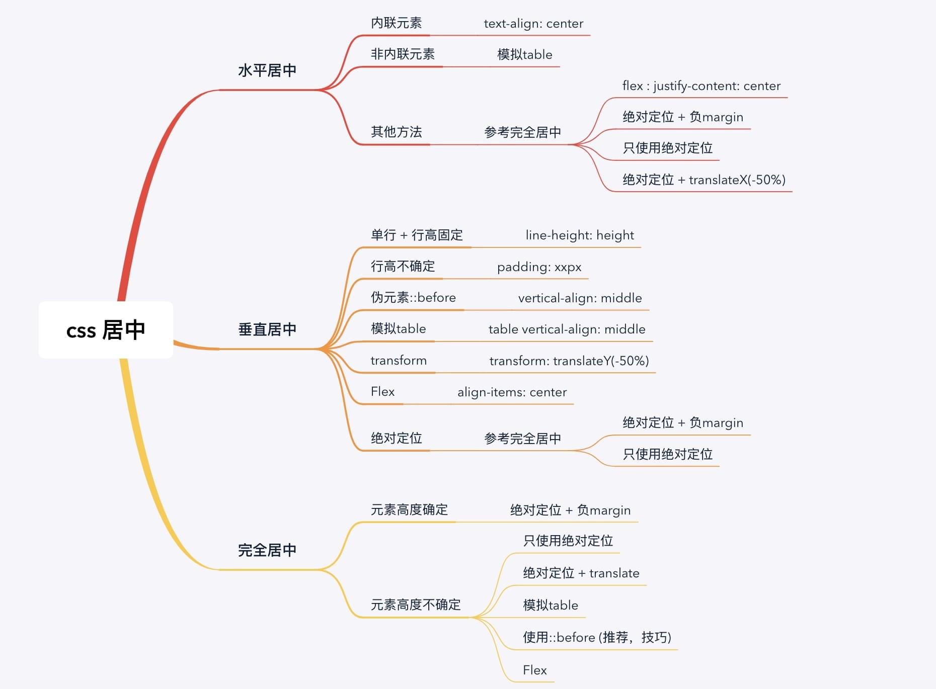
概述
本文将介绍几种常用的水平、垂直和完全居中方法。
主要方法有:3种绝对定位、flex、table、伪元素::after 等方法。
后面的例子都以此 html 为样本。
1 | <div class="parent"> |
提示: 绝对定位+负margin、只使用绝对定位 和 绝对定位+transform 对应的9种居中里,有7种 position 值可以是下面任意一种组合。
- 父元素为
position: relative,子元素为position: absolute。 - 父元素默认
position,子元素为position:relative。 - 剩下
只使用绝对定位(垂直居中)和只使用绝对定位(完全居中)两种,position只能使用relative + absolute的第一种方式。
水平居中
内联元素
内联元素直接使用text-align: center。1
2
3
4
5.centered {
border: 1px solid green;
display: inline;
text-align: center;
}
模拟table
区块元素模拟成table,然后使用text-align: center。1
2
3
4
5
6
7
8
9
10
11.parent {
width: 400px;
height: 300px;
border: 1px solid pink;
display: table;
}
.centered {
border: 1px solid green;
display: table-cell;
text-align: center;
}
flex
任何元素改成弹性盒子类型,然后使用justify-content: center。1
2
3
4
5
6
7.parent {
width: 400px;
height: 300px;
border: 1px solid pink;
display: flex;
justify-content: center;
}
绝对定位+负margin
设置子元素:使用
left: 50%定位到父元素水平中心,然后margin-left: -xpx向左偏移子元素 宽的一半 。1
2
3
4
5
6
7
8
9
10
11
12
13
14.parent {
width: 400px;
height: 300px;
border: 1px solid pink;
position: relative;
}
.centered {
width: 100px;
height: 60px;
border: 1px solid green;
left: 50%;
margin-left: -50px; /* 100px的一半 */
position: absolute;
}
只使用绝对定位
设置子元素
left: 0,right: 0和margin: x auto来实现水平方向居中。1
2
3
4
5
6
7
8
9
10
11
12
13.parent {
width: 400px;
height: 300px;
border: 1px solid pink;
}
.centered {
width: 300px; /* 不确定 */
height: 60px;
border: 1px solid green;
left: 0;
right: 0;
margin: auto;
}
绝对定位+translateX
设置子元素: 使用
left: 50%定位到父元素的水平中心,然后transform: translateX(-50%)向左偏移子元素 宽的一半 。1
2
3
4
5
6
7
8
9
10
11
12
13
14.parent {
width: 400px;
height: 300px;
border: 1px solid pink;
position: relative;
}
.centered {
width: 100px;
height: 60px;
border: 1px solid green;
left: 50%;
transform: translateX(-50%);
position: absolute;
}
垂直居中
单行+行高固定
设置
line-height等于height。1
2
3
4
5
6.centered {
width: 100px;
height: 60px;
line-height: 60px;
border: 1px solid green;
}
行高不固定
设置上下
padding相等。1
2
3
4
5.centered {
width: 100px
padding: 40px; /* 水平方向不能使用auto,即使我们只想设置垂直方向的padding */
border: 1px solid green;
}
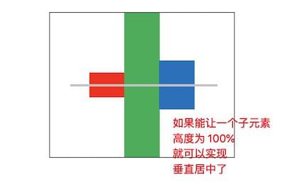
伪元素::before(推荐,技巧)
利用父元素的
vertical-align: middle属性来实现垂直居中。vertical-align适用于内联元素,所以子元素要设置成display:inline或display:inline-block。vertical-align是相对 所有子元素垂直居中,如果有一个子元素的高度为 100%,那就会 相对父元素垂直居中 了 。所以,我们可以添加一个高度为100%的伪元素来达到这种效果。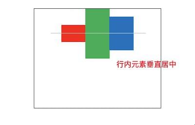
实现代码:
1
2
3
4
5
6
7
8
9
10
11
12
13
14
15
16
17
18
19
20.parent {
width: 400px;
height: 300px;
border: 1px soild pink;
}
.centered: {
width: 100px;
height: 60px;
border: 1px solid green;
display: inline-block;
vertical-align: middle;
}
.parent::before {
content: '';
width: 0;
height: 100%;
background: #ccc;
display: inline-block;
vertical-align: middle;
}
模拟table
把元素模拟成
table,然后使用vertical-align: middle来实现垂直居中。1
2
3
4
5
6
7
8
9
10
11.parent {
width: 400px;
height: 300px;
border: 1px solid pink;
display: table;
}
.centered {
border: 1px solid green;
display: table-cell;
vertical-align: middle;
}
transform
和
水平居中类似,只是改成垂直方向。1
2
3
4
5
6
7
8
9
10
11
12
13.parent {
width: 400px;
height: 300px;
border: 1px solid pink;
}
.centered {
width: 100px;
height: 60px;
top: 50%;
border: 1px solid green;
transform: translateY(-50%);
position: relative;
}
flex
利用
align-items: center来实现垂直居中。align-self也可以垂直居中。区别是align-items设置在弹性容器上,align-self设置在弹性子元素上。align-content也可以达到垂直居中的效果,但是必须设置flex-wrap: wrap或flex-flow: xx wrap(wrap-reverse也可)。1
2
3
4
5
6
7.parent {
width: 400px;
height: 300px;
border: 1px solid pink;
display: flex;
align-items: center;
}
绝对定位
和
水平居中类似,分为绝对定位+负margin、只使用绝对定位和绝对定位+translateY三种。最后一种在上面
transform已经介绍过了,这里只介绍前面两种。1
2
3
4
5
6
7
8
9
10
11
12
13
14
15
16
17/*
绝对定位+负margin
适用于 高度确定 的情况
*/
.parent {
width: 400px;
height: 300px;
border: 1px solid pink;
}
.centered {
width: 100px;
height: 60px;
border: 1px solid green;
top: 50%;
margin-top: -30px; /* 60px的一半 */
position: relative;
}1
2
3
4
5
6
7
8
9
10
11
12
13
14
15
16
17
18
19/*
只使用绝对定位
适用于 高度不确定 的情况
*/
.parent {
width: 400px;
height: 300px;
border: 1px solid pink;
position: relative;
}
.centered {
width: 100px;
height: 60px; /* 不确定 */
border: 1px solid green;
top: 0;
bottom: 0;
margin: auto;
position: absolute;
}
完全居中
完全居中 就是把 水平居中 和 垂直居中 组合起来,使用的大部分方法前面都已经介绍过了。
元素高度确定
绝对定位+负margin
使用
left: 50%和top: 50%定位到父元素的完全中心,然后使用margin-left:-xpx和margin-top: -ypx来水平和垂直偏移子元素 一半的宽高 。1
2
3
4
5
6
7
8
9
10
11
12
13
14
15.parent {
width: 400px;
height: 300px;
border: 1px solid pink;
}
.centered {
width: 100px;
height: 60px;
border: 1px solid green;
left: 50%;
top: 50%;
margin-left: -50px;
margin-top: -30px;
position: relative;
}
元素高度不确定
只使用绝对定位
使用
left: 0、top: 0、right:0、bottom: 0和margin: auto来设置成完全居中。position只能使用relative + absolute这种。1
2
3
4
5
6
7
8
9
10
11
12
13
14
15
16
17.parent {
width: 400px;
height: 300px;
border: 1px solid pink;
position: relative;
}
.centered {
width: 100px;
height: 60px;
border: 1px solid green;
left: 0;
top: 0;
right: 0;
bottom: 0;
margin: auto;
position: absolute;
}
绝对定位+translate
使用
left: 50%和top: 50%来定位到父元素的完全中心,然后使用transform: translate(-50%, -50%)向左上偏移子元素 宽高的一半 。1
2
3
4
5
6
7
8
9
10
11
12
13
14.parent {
width: 400px;
height: 300px;
border: 1px solid pink;
}
.centered {
width: 100px;
height: 60px;
border: 1px solid green;
left: 50%;
top: 50%;
transform: translate(-%50, -50%);
position: relative;
}
模拟table
模拟成
table,然后使用text-align: center和vertical-align: middle来达到完全居中。1
2
3
4
5
6
7
8
9
10
11
12.parent {
width: 400px;
height: 300px;
border: 1px solid pink;
display: table;
}
.centered {
border: 1px solid green;
display: table-cell;
text-align: center;
vertical-align: middle;
}
伪元素::before(推荐,技巧)
水平方向使用
dispaly:inline-block和text-align: center来实现。垂直方向使用
::before伪元素来实现。1
2
3
4
5
6
7
8
9
10
11
12
13
14
15
16
17
18
19
20.parent {
width: 400px;
height: 300px;
border: 1px solid pink;
text-align: center;
}
.center {
width: 100px;
height: 60px;
border: 1px solid green;
display: inline-block;
vertical-align: middle;
}
.parent::before {
content: '';
width: 0;
height: 100%;
display: inline-block;
vertical-align: middle;
}
flex
使用
justify-content: center来水平居中。使用
align-items: center来垂直居中。align-self和align-content也可用来垂直居中,只是前者要使用在弹性子容器上,后者要添加flex-wrap: wrap(或相关)。1
2
3
4
5
6
7
8
9
10
11
12
13.parent {
width: 400px;
height: 300px;
border: 1px solid pink;
display: flex;
justify-content: center;
align-items: center;
}
.centered {
width: 100px;
height: 60px;
border: 1px solid green;
}